March 20, 2017Comments are off for this post.

NVCAC

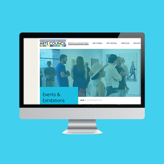
Community Arts Centre Website | Responsive WordPress Design & Development

How do you build a stronger community through the arts and heritage? Founded in 1969, the North Vancouver Community Arts Council is a charitable community cultural organization whose mandate is to enable emerging and professional artists in all media and to bridge cultures and build strong communities through the arts and heritage.


The Brief

NVCAC is an organization that consists of a volunteer Board of Directors, an Executive Director and support staff, and over 100 dedicated volunteers. Their membership is over 500 strong and includes individuals, students, seniors, families, cultural groups and businesses.

Their website was outdated and their mobile users were dropping fast. They needed to better showcase the extensive depth of programming and resources offered - all on a mobile friendly platform.


The Solution

After series of prototypes (UX design) and complete interface design NVCAC made the leap to move from Drupal to WordPress. We were there to support them and implemented a strategic planning series to make the transition possible. We also wanted NVCAC to take advantage of the many tools/connections WordPress has to offer. The result was a custom built WordPress theme that includes e-commerce, art rental catalogue, membership area, and multiple custom post types to keep the backend organized.

The design is focused on bringing the NVCAC brand to life. We used the rich colours from their logo to classify different areas of the website. Every template design, focused on use of imagery from their database and this brought a new level of interaction and emotion to the online experience that was missing on the old website.

Design / Development Features

Memberships
The public can purchase NVCAC memberships online and gain access to member only pages (area), online profile submission and automated discounts.

E-Commerce
A full scale e-commerce solution that connects to their current POS. WooCommerce + Moneris  is used to sell event tickets, course registration, products, memberships, donations and more.

Digital Art Rental Catalogue
A custom template that showcases (without selling) individual art rental items. Users can also create their own wishlist and save it to their account for future reference.

Backend CMS Management
A series of custom fields were built in the backend to make publishing content easier on the NVCAC staff. This helps to keep their look consistent yet easy to manage.


Phase 1

From Drupal to WordPress - Strategy & Prototypes

This site was huge! And we were up for the challenge. Lots of planning was required to consider:

  • NVCAC user goals and our goals for them
  • The sitemap/ user navigation
  • Content flow
  • Migration of content
  • Development options and existing tools to reduce on budget

Before we get to the pretty stuff we always focus on wireframes or interactive prototypes. It’s important to set a good foundation to build on. We test with out clients and make sure all the bases are covered.


Phase 2

Designing for a Creative Community

Our goal was to help boost NVCAC brand awareness but also let the community culture and creative artwork shine! We choose collectively to pull colours from the NVCAC logo to help identify key areas of the website. We looked to Mondrian to find inspiration for using colour and grid system. It was also important to build a design system so that the large volume of pages on this site and external design materials could be kept uniform and void of clutter. This enabled the images of the community or artwork to pop!


Phase 3

Custom Post Types, E-Commerce, Catalogue & Memberships

This custom built WordPress theme has it all. Our favourite section is the art rental area. Since art is big and fragile NVCAC only wanted to showcase, and not sell art online. We took the benefits of using an e-commerce platform and build a custom template to showcase each item and the artists. It removes the ability to purchase but invites customers to contact NVCAC directly. The film & TV industry, corporations and homeowners can also save a collection online by creating a wishlist.


September 12, 2015Comments are off for this post.

ARC

Photography Blog Branding

Arc's mission is to educate & inspire creative’s to excel as artists & entrepreneurs. They believe in a new kind of learning environment that fosters creativity & social connections. They want to expose their readers to creative insight from photographers outside their own field. They believe learning from others will bring our community clarity, happiness and joy through creativity.

Arc contacted Paone Creative to develop a photography blog brand that connected with photographers & creatives alike. The brand needed to empower their inspiring, educational, interview style website. It was also important to pull inspiration from the geographical location of its inception - the west coast of Canada.

logo: Photography blog branding design for Arc. Design by Paone Creative, a Vancouver logo, branding and website designer.

Business cards: Photography blog branding design for Arc. Design by Paone Creative, a Vancouver logo, branding and website designer.

logo: Photography blog branding design for Arc. Design by Paone Creative, a Vancouver logo, branding and website designer.

copywriting: Photography blog branding design for Arc. Design by Paone Creative, a Vancouver logo, branding and website designer.

moodbord: Photography blog branding design for Arc. Design by Paone Creative, a Vancouver logo, branding and website designer.

colour palette: Photography blog branding design for Arc. Design by Paone Creative, a Vancouver logo, branding and website designer.

stationery: Photography blog branding design for Arc. Design by Paone Creative, a Vancouver logo, branding and website designer.

LAUNCH WEBSITE

September 5, 2015Comments are off for this post.

ManageWP Blog

Custom Blog UI Design

ManageWP is the world’s first and leading provider of WordPress management software. Their mission is to enhance your WordPress experience. ManageWP hosts a popular blog but the interface was lacking in spirit. Paone Creative worked in collaboration with Tom Ewer to design a custom UI for the ManageWP blog. The goal was to improve readability on all screen sizes with a clean and non-distracting interface. It was also important to highlight the individual authors that contribute to the blog. Paone Create also created a custom icon set to help define the blog categories.


ManageWP blog design Case  Study

ManageWP blog design Case  Study

ManageWP blog design Case  Study

ManageWP blog design Case  Study

ManageWP blog design Case  Study

"We hired Christina to design our new website and found a true professional in her field. Christina's approach was attentive, she would ask the right questions and make sure that every aspect of the project is taken care of."
-Vladimir Prelovac, Entrepreneur. Product strategist. CEO Devana Technologies.

LAUNCH WEBSITE

June 15, 2015Comments are off for this post.

Spectrum & Give Canada

Corporate Website Design & Development

Spectrum Marketing & Give Canada Fundraising both operate out of the same office, are managed by the same team and work to build lasting partnerships. However one is focused on corporate clients while the other is philanthropic focused. We built them a responsive WordPress website to showcase the strength of both businesses together. We also included a landing page template to highlight each business individually. To improve usability and recognition, Spectrum is showcased using the colour blue, Give Canada appears in red and combined they appear yellow.


Spectrum-portfolio-1000x500_04
Spectrum-portfolio-1000x500_01

Spectrum-portfolio-1000x500_02

Spectrum-portfolio-1000x500_03

Spectrum-portfolio-1000x500_05

"Spectrum Marketing and Give Canada Fundraising recently hired Paone Creative to redesign our website. Combining two unique companies into one was a challenge but Christina developed a workable, easy to navigate solution. With Christina's creativity our updated brand more fully engages our online audience. She was approachable, easy to work with and really took the time to understand our business and our needs."
-Pam Burns, Vice President at Spectrum Marketing / Give Canada Fundraising

LAUNCH WEBSITE

January 6, 2015Comments are off for this post.

604 Food Co

BC Food Manufacturer Branding & Packaging

Their mission is to enrich your kitchen with chef quality food products - inspired by the sea-to-sky lifestyle. 604 Food Co. is locally owned, locally produced and they do their best to source Canadian products. They live and eat in the sea-to-sky country and work hard to support local businesses. They produce chef quality products in sustainable packaging.

Paone Creative was tasked with creating a BC food manufacturer branding and packaging system that embodied this good-hearted product. The branding had to showcase the sea-to-sky, locally produced, spirit of the product. 604 Food Co is a startup business and we needed to make sure the packaging system was affordable yet looked professional as they expand.

BC Food Manufacturer Branding & Packaging design by Paone Creative, a Vancouver logo, branding and website design studio.

BC Food Manufacturer Branding & Packaging design by Paone Creative, a Vancouver logo, branding and website design studio.

BC Food Manufacturer Branding & Packaging design by Paone Creative, a Vancouver logo, branding and website design studio.

BC Food Manufacturer Branding & Packaging design by Paone Creative, a Vancouver logo, branding and website design studio.

BC Food Manufacturer Branding & Packaging design by Paone Creative, a Vancouver logo, branding and website design studio.

January 9, 2014Comments are off for this post.

Scandilicious

Vancouver Restaurant Branding & Packaging

It certainly is!™ This Vancouver restaurant branding is more than just a tasty logo. Scandilicious is a Scandinavian inspired bakery located on Commercial Drive. Their sweet and savoury waffles are best in Vancouver and the coffee is a must. The Scandilicious persona is fun, flirty and delicious - just like its’ wordmark. The logo suggests the wafting aromas, gooey batters and sweet sauces that are undeniably Scandilicious. Inspired by its’ heritage, the final letter 'S' stands tall to represent the prow of a Viking ship.


vancouver restaurant branding for Scandilicious. Paone Creative; a vancouver graphic designer offering logo, website and App UI design.

vancouver restaurant branding for Scandilicious. Paone Creative; a vancouver graphic designer offering logo, website and App UI design.

vancouver restaurant branding for Scandilicious. Paone Creative; a vancouver graphic designer offering logo, website and App UI design.

vancouver restaurant branding for Scandilicious. Paone Creative; a vancouver graphic designer offering logo, website and App UI design.

vancouver restaurant branding for Scandilicious.

vancouver restaurant branding for Scandilicious. Paone Creative; a vancouver graphic designer offering logo, website and App UI design.

Vancouver Restaurant Branding Solutions

Paone Creative worked closely with the owner of Scandilicious during the construction stages of their new business. Our goal was to create a bold new brand that could compete in the Vancouver restaurant branding and food marketplace.

Paone Creative worked closely with the restaurant owner to first develop a concrete brand persona and logo design strategy. Scandilicious came with a great name, it was our task to bring that brand persona and flirty name to life. The logo has a two part message, as you have read above. The brand was kept clean and traditional with a red, white and blue colour palette. The restaurant interiors & food truck match this Vancouver restaurant branding package. Anita, the founder, worked very hard to ensure her brand was ‘traditional Scandinavian’ rather than a stereotypical copycat. There is a lot of heart and tradition that goes into all the recipes served at Scandilicious.

Coffee Bag Design

No bakery experience is complete without wafting aromas of fresh brewed coffee. Paone Creative was happy to create a unique and versatile coffee bag. The bag had to amplify the visuals established for this Vancouver restaurant branding project. A ribbon pattern was made using the colours of the Norwegian flag. The ribbon wraps around the bag just like a parcel or a gift - it’s all wrapped up and ready for you to give. Scandilicious sells specialty blends of coffee in small batches. For economical purposes the bag was designed to be generic and a sticker is used to identify with the different bean types.

January 9, 2014Comments are off for this post.

Alfred Horie Construction

Vancouver Corporate Branding

Alfred Horie Construction offers buildings solutions in the province of British Columbia. The company has grown and evolved since opening it’s doors in Vancouver circa 1893. With their varied and expansive list of offerings the company needed to clarify their name, tagline and visual identity.

Solidifying an official name and tagline was no small achievement. The opinions regarding the company key offerings were varied, across a board of passionate individuals. Paone Creative worked with the group to discover a unified vision for the company. This is a great example of the Vancouver corporate branding services offered by Paone Creative.

vancouver corporate branding by Paone Creative .com - we offer boutique graphic design services for business in bc

vancouver corporate branding by Paone Creative .com - we offer boutique graphic design services for business in bc

vancouver corporate branding by Paone Creative .com - we offer boutique graphic design services for business in bc

vancouver corporate branding by Paone Creative .com - we offer boutique graphic design services for business in bc

vancouver corporate branding by Paone Creative .com - we offer boutique graphic design services for business in bc

vancouver corporate branding by Paone Creative .com - we offer boutique graphic design services for business in bc

Identity Solution

The new identity is a modern day approach to AHC’s past logo mark. It instils a sense of solid construction. An extensive stationery set was developed to unify their brand and extended to all company divisions. The business cards function as a mini portfolio for this Vancouver corporate branding project. Multiple cover images were chosen to showcase the different projects and services offered by AHC..

Website Solution

AHC had very little online presence. Their past website was built with poor technology and prohibited good SEO. We provided them with a branded WordPress website to boost their search engine rankings. The new company divisions of offerings had to be clearly accessible for this Vancouver corporate branding project. We also wanted to include a link to their historic past. A unique feature of the website is a live video stream from current job sites across Canada. This is a great way to engage your audience and also leaves you with a complete video of the process. Let’s talk about how Paone Creative can incorporate video content into your Vancouver corporate branding project.

Paone Creative worked to develop their YouTube page which was a strategic social media decision. No Vancouver corporate branding project is complete without great photography. Paone Creative was sent to various project sites to capture images after & during construction.

LAUNCH WEBSITE

January 8, 2014Comments are off for this post.

Patti Smyth

Holistic Nutritionist Brand & Stationery

Patti Smyth is a registered holistic nutritionist and passionate outdoor enthusiast. Her mantra is simple, ‘eat food - move your body’. Patti came to Paone Creative in need of a personal holistic nutritionist brand. Rather than building a brand around the stereotypical green and kraft textures Patti embraced the exploration process and we were able to discover a brand that will inspire.


holistic nutritionist branding by Paone Creative. We build brands that inspire; offering logo, website and App design in Gastown.

holistic nutritionist branding by Paone Creative. We build brands that inspire; offering logo, website and App design in Gastown.

holistic nutritionist branding by Paone Creative. We build brands that inspire; offering logo, website and App design in Gastown.

holistic nutritionist branding by Paone Creative. We build brands that inspire; offering logo, website and App design in Gastown.

holistic nutritionist branding by Paone Creative. We build brands that inspire; offering logo, website and App design in Gastown.

Our Solution For This Holistic Nutritionist Brand

Patti knew that just because she offered holistic lifestyle coaching didn’t mean she had to greenwash her brand. Since we were branding Patti as a person, we decided to embrace her favorite colour magenta. The watercolour texture provides a sense of wholesomeness and tactility to the brand. The logo works in contrast to this by offering a very clean solution. We also made sure to include her designation in her logo. Patti motivates other to live a clean and wholesome lifestyle and this holistic nutritionist brand represents just that.

To launch her new business we created an identity package for Patti: logo, stationery set and graphic standards. We also designed a promotional card that featured her most popular recipe. The goal of that card was to create something motivational and beautiful that clients are likely to keep in their kitchen. This identity package will set the tone as her holistic nutritionist brand grows.

January 5, 2014Comments are off for this post.

Google+ UX Workshop

Learning to solve problems like the Google+ UX team

Last week I took a road-trip down to Portland, to enjoy some a amazing food and attend a Google+ UX workshop. The workshop was one of many events part of Design Week Portland (#DWPDX). If you are a designer or creative person of any type, add Design WeekPortland to your bucket list. It is a week long event series of open houses, workshops, lectures and a great opening night party.

Design at scale

Our first talk, was on the topic of design at Google+. The concept of 'design at scale', was introduced. At Google, they call it Moon Scale, meaning "it's 10x better not just 10% better - we have a healthy disregard for the impossible". This really established the theme for the day; we were going to problem solve on a moon scale.

A great example of this is Google maps. Think about how google maps has redefined the way we interact with geography. It didn't just make map reading easier and more accessible. Google maps introduced a completely new interaction on how we get from point A - B. Or think about how we can now visit a new city without leaving our home.


#dwpdx Photo by Gia Goodrich courtesy of Design Week Portland

Christina at the workshop photo © Design Week Portland


Google+ UX Workshop: Our challenge for the day

On arrival we were greeted by the Google UX team and split into small groups of 5. Each group was given a Google+ mentor for the day to guide our process and push our ideas further. We were given the challenge of solving an issue, related to our growing urban populations. Could we identify a problem? Then create a solution and pitch it to a mock city of Portland/ Google business panel? All within a 5 hour span. This was definitely a day filled with moon scale thinking. Each team proposed some great solutions and products.

Throughout the day we were given 3 talks, here are some highlights...


Google+ UX Workshop: Photo by Gia Goodrich courtesy of Design Week Portland

Our first presentation of the day photo © Design Week Portland


Design Considerations

At Google, a designer has 3 primary considerations to be aware of...
- Human: who is going to use the product and how will it effect them.
- Engineering: "Design is the direction but engineering is the engine that gets us there".
- The Google brand: Does it look, feel and act like Google?


Google+ UX Workshop: Photo by Gia Goodrich courtesy of Design Week Portland

This is what most of the day looked like photo © Design Week Portland


Research Considerations

The talk started with the popular venn diagram that many creatives use to sell their clients on how design works - the 'good vs fast vs cheap' but you can only pick two. This also applies to project research. Here are some methods...

Fast & cheap user research: The Scrappy Method
Google things other people have found to be true. Creating lit reviews and competitor evaluations are a great place to start.

Cheap & Good: Ask Why?
Ask why you do what your doing. Don't force the question on your customers. Ladder your questions and work through solutions.

Fast & Good: The not so scrappy
Question your assumptions. Maybe this is a simple Q&A with your colleagues to confront assumptions. Or maybe you need to meet your user-base in their own environment to watch how they interact.


Google+ UX Workshop: Photo by Gia Goodrich courtesy of Design Week Portland

Our group brainstorming on sticky notes photo © Design Week Portland


Engineering Considerations

We also got a nice venn diagram during this talk. However the subject matter was very different. This diagram displayed the working relationship between the designer, engineer and Project Manager (the complete Google+ UX team). Each role has to work independently and also collaboratively.

Engineering considerations: Human & Brand, Privacy, Legal, Security, Technical.

Next we got on the topic of the North Star. At Google+ it is really important to have a high-level project goal, your North Star. This keeps your project on course; most likely changes to specific tasks will occur during a project but a North Star will keep you from straying too far off track. It is also great for communication between groups and gaining client/ executive buy-in.


Google+ UX Workshop: Photo by Gia Goodrich courtesy of Design Week Portland

Our group pitching the final idea photo © Design Week Portland


Event Hashtags

Check your network for Design Week Portland highlights & photos:
Google+ UX workshop: #gpluspdx
Design Week Portland: #dwpdx

Be sure to checkout more amazing photos of the event on flickr by Gia Goodrich.

November 18, 2013Comments are off for this post.

Rebecca Sehn

Childrens Book Themed Website

Rebecca Sehn is a talented children’s photographer based in Vancouver, BC. Rebecca had just made the transition to focus her business 100% on children’s photography and needed a website to evoke the whimsical personality of childhood. The focus was directed towards easy navigation and defining her key offerings. Custom illustration was used throughout the site and extended to all stationery items to set the tone for her Children’s book themed website and brand.

children's book themed website by www.PaoneCreative.com; a Vancouver design studio offering branding, website and App UI design

This video records the entire process of how the custom artwork was made for this children's book themed website. It’s an exclusive sneak peek into the attention and detail that we provide for every client.

children's book themed website by www.PaoneCreative.com; a Vancouver design studio offering branding, website and App UI design

Why WordPress?

The WordPress platform made it easy for Rebecca to manage & edit her website. She can simply log-in to her WordPress dashboard to edit text, images, layout and more. This custom children's book themed website was structured to work within the clients budget. However we always strive to allow for page variety. The primary goal was to set her apart from the competition by building a heavily branded visual experience – something more than a regular photographers portfolio.

How Was The Children’s Book Theme Brand Created?

Rebecca was a very adventurous client - which we love! Many photographer lean towards simplicity when it comes to their portfolio. Rebecca was the exact opposite - she wanted to create a fully branded environment. Our goal was to create a space that felt as if you were ‘alice’ and had just fallen into a, ink drawn, copy of your favourite childhood novel. All the artwork was hand-drawn by Paone Creative. We also create a custom alphabet and icons for this children's book themed website.

LAUNCH WEBSITE

Contact
[email protected]
Based in Vancouver, Canada

Contact Us
[email protected]
Based in Vancouver, Canada

Contact Us
[email protected]
Based in Vancouver, Canada

       
© 2017 Paone Creative | Privacy Policy

© 2017 Paone Creative | Privacy Policy

 © 2017 Paone Creative | Privacy Policy