November 17, 2013Comments are off for this post.

Fiitfu iphone App

iPhone App Design

Fiitfu was so happy with their branding and software UI design that they came back to Paone Creative to work on their new iphone app design. It was so exciting to see this Vancouver start-up grow and to help them develop a mobile specific platform for their clients. Fiitfu is a web based CRM program built specifically for network marketers. The software is built to help manage clients and products but more importantly aid in follow-up.

View the branding and software interface design work completed by Paone Creative here.

vancouver iphone app design for Fiitfu CRM. Design by Paone Creative, a Vancouver logo, website and app UI designer.

vancouver iphone app design for Fiitfu CRM. Design by Paone Creative, a Vancouver logo, website and app UI designer.

vancouver iphone app design for Fiitfu CRM. Design by Paone Creative, a Vancouver logo, website and app UI designer.

vancouver iphone app design for Fiitfu CRM. Design by Paone Creative, a Vancouver logo, website and app UI designer.

vancouver iphone app design for Fiitfu CRM. Design by Paone Creative, a Vancouver logo, website and app UI designer.

vancouver iphone app design for Fiitfu CRM. Design by Paone Creative, a Vancouver logo, website and app UI designer.

vancouver iphone app design for Fiitfu CRM. Design by Paone Creative, a Vancouver logo, website and app UI designer.

Why Build An iphone App?

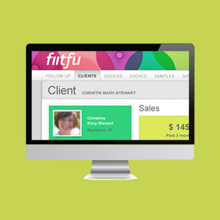
Fiitfu is a web-based CRM service targeted at network marketers. Many of Fiitfu’s user base are individuals working from home or on the road. Many of them host meetings in coffee shops or out of the office. Fiitfu wanted to offer their clients a mobile solution to record meetings, look-up customer details and access their calendar. Fiitfu’s primary goal is to aid in follow up, so naturally this had to be at the center of the iphone app design.

Our goal was to offer an iphone app design that intuitive for working women aged 25-45. As with every app design, we wanted to ensure the client could use the app without a large learning curve. It was essential for the app to extend the function of the online software without confusing existing clients. This iphone app design also gave us an opportunity to improve the user interface of Fiitfu. We were able to move the brand forward while still keeping inline with the original brand message.

Our Solution

The Dashboard
Fiitfu as a company works very hard to motivate and inspire follow up with its users. We built the iphone app design around this company mission. The dashboard features a motivational quote, photo and goal. It also has a list of todays follow ups.

Navigation
We took advantage of the use of side panel navigation for this iphone app design. The left panel pulls out to reveal your main navigation area. We wanted to create easy action buttons for users-on-the-go. These key actions are: add a client , add a calendar item, record a meeting, and record a product given. Every action item guides users to ensure completion and improve success rates. The left panel slides out as an exclusive client list & client search area.
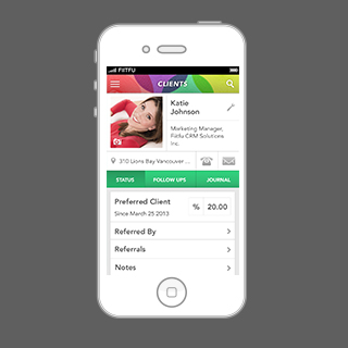
User Profiles
We wanted to have fun with the user profile design. We allow Fiitfu clients to add large volumes of client details. However the iphone app design allows for easy reading and divides the content into categories. Users can also upload a photo for every client.

vancouver iphone app design for Fiitfu CRM. Design by Paone Creative, a Vancouver logo, website and app UI designer.

November 17, 2013Comments are off for this post.

Riverwood Sales

Vancouver Restaurant Website Design & Illustration

Riverwood Sales is a leading Western Canadian Food Service Sales Agency. They came to Paone Creative in need of a new website. Their primary goal was to build a website that not only showcased their work, it also had to be easy to maintain and update. With this fun spirited group, Paone Creative was inspired to create a completely illustrated new brand.


vancouver restaurant website design by Paone Creative; a local studio offering logo, website and email marketing.

vancouver restaurant website design by Paone Creative; a local studio offering logo, website and email marketing.

vancouver restaurant website design by Paone Creative; a local studio offering logo, website and email marketing.

Why WordPress?

Our goal was to bring the spirited personality of the Riverwood staff to this online experience. We approached this project just as we would for a vancouver restaurant website design. We expanded on their existing colour pallet and incorporated custom illustration and typography to style this food services website. The staff connected so well with their brand re-fresh, that it was extended to all company communication tools.

WordPress was the perfect website platform because of its easy-to-use CMS (Content Management System). With WordPress tools, any staff member can make edits and additions to the website. This is a benefit to the company because it means reduced long-term expenses and allows for instant updates.

A custom interface was built to set Riverwood Sales apart from the competition and offer simplified navigation. Custom graphic illustration and google web fonts act as visual keys to showcase the personality of the company on this vancouver restaurant website design.

LAUNCH WEBSITE

November 16, 2013Comments are off for this post.

CAIN

The Canadian Association of International Nursing approached Paone Creative to aid in brand development for a their non-profit organization. We also designed and developed a website that allowed new and existing members pay their annual membership dues online. Paone Creative was happy to help establish this Vancouver non-profit brand.


Vancouver non-profit branding & website by Paone Creative .com; a Vancouver design studio offering branding, website and App UI design.

Vancouver non-profit branding & website by Paone Creative .com; a Vancouver design studio offering branding, website and App UI design.

Vancouver non-profit branding & website by Paone Creative .com; a Vancouver design studio offering branding, website and App UI design.

Vancouver non-profit branding & website by Paone Creative .com; a Vancouver design studio offering branding, website and App UI design.

Logo & Identity

The core message within the CAIN logo is depicted by two supportive hands, representing the flow of care passed from practitioner to patient. It is a story that resonates deeply with all nurses across all barriers: land, language, politics and beyond. These two hands are transformed to depict two speech bubbles emphasizing CAIN’s goal of enabling dialogue amongst Canadian nurses. The hands together form a globe wrapped by the symbol of a Canadian maple leaf. Our goal was to create a Vancouver non-profit brand that was bold yet meaningful.

Custom WordPress Website

CAIN connects nurses all across Canada and their website acts as the main interaction point. The website allowed us to bring this Vancouver non-profit brand to life, online. It positions CAIN as a forward thinking organization and works well to attract new members. WordPress was the preferred Content Management System for CAIN because of its easy-to-use editing tools. Since website management rolls will be transferred between members, the intuitive WordPress dashboard allows new managers to learn how to edit quickly.

Membership Registration & Payment

We built an e-commerce feature so that new and existing members could pay their annual membership dues through the website. They can pay with credit card via PayPal or by cheque. Members can also update their profile at anytime. All profiles and payments are recorded in the WordPress dashboard so CAIN can manage and export data easily. We made sure to extend the visuals created for this Vancouver non-profit brand to all aspects of the website.

LAUNCH WEBSITE

September 18, 2013Comments are off for this post.

ON TRAC

ON TRAC is a healthcare initiative at BC Children’s Hospital. The program goal is to build awareness and develop tools to help youth Transition Responsibly To Adult Care. The initiative was in need of a visual identity to unite a wide variety of program aspects. This Vancouver healthcare branding project also directs ownership and recognition to ON TRAC.

Vancouver healthcare branding and website design services from Paone Creative. We build brands that inspire!

Vancouver healthcare branding and website design services from Paone Creative. We build brands that inspire!

Vancouver healthcare branding and website design services from Paone Creative. We build brands that inspire!

Vancouver healthcare branding and website design services from Paone Creative. We build brands that inspire!

Vancouver healthcare branding and website design services from Paone Creative. We build brands that inspire!

Vancouver healthcare branding and website design services from Paone Creative. We build brands that inspire!

Logo Design & Identity Package

The logo was designed to represent two coexistent stories. A story of prescribed health and a story of its motivating network. A wordmark was chosen to build name recognition for this Vancouver healthcare branding project. Team sports inspired the logo’s typeface to connect with the primary youth audience.

The letter ‘R’ became a focal point within the wordmark. It symbolizes the abbreviation (Rx) for Prescription: a program for health-care. It also represents the interchangeable key ‘R’ words that define the characteristics & goals of the program.

Included in this Vancouver healthcare branding package:
Logo & Icons
Stationery Set: Business Card, Letterhead, Power Point Template
Rack Card Brochures & Trade Show Banners
E-mail Newsletter Marketing

Email Newsletter Template & Delivery Management

ON TRAC also asked us to help with their bi-annual email newsletter. Paone Creative built a custom template to fit large volumes of content. The design also incorporated strategically placed buttons to increase ‘click’ rates. Each newsletter is built in HTML to ensure direct inbox delivery and also allows subscribers to open emails on their iPhone.

Paone Creative manages the design and delivery of every issue for this Vancouver healthcare branding project. We collect the content from the ON TRAC team, design, program and manage delivery through MailChimp.

*Disclaimer: This logo design is not currently in use by the ON TRAC division as projects at BC Children's Hospital do not use a unique logo for communication.

LAUNCH WEBSITE

September 18, 2013Comments are off for this post.

Fiitfu CRM Solutions

Fiitfu CRM Solutions is a start-up company that came to Paone Creative looking for a CRM branding and product design package. Fiitfu is a web based CRM program built specifically for network marketers. The software is built to help manage clients and products but more importantly aid in follow-up.

CRM User Interface design by Paone Creative

Branding elements & logo sketch | CRM branding by Paone Creative .com; a Vancouver design studio offering branding, website and App UI design.

CRM User Interface | CRM branding by Paone Creative .com; a Vancouver design studio offering branding, website and App UI design.

website design | CRM branding by Paone Creative .com; a Vancouver design studio offering branding, website and App UI design.

Identity & Logo Design

Paone Creative provided Fiitfu with a complete CRM branding package. We developed the logo, stationery and brand aesthetics. The name Fiitfu was conceived as an acronym ‘Fortune Is In The Follow-up” but it has now evolved to represent much more. A wordmark was chosen to build name recognition online. Custom lettering was drawn to resonate with an energetic and motivated individual. The top of the letter ‘F’ was shaped into an arrow to represent the motion of ‘Follow-up’. A secondary element was created for the CRM branding to incorporate colour and energy. The spiral like shapes are inspired by a slinky toy, notorious for its continuous crawling forward motion.

Software UI Design

After establishing the new brand Paone Creative began work on the software user interface design. Our goal was to inject the lively & forward thinking personality of the CRM branding into the user interface design. We did this through the use of colour and engaging design elements.

Email Newsletter Marketing

Paone Creative designed, developed and managed a series of email newsletter campaigns for Fittfu. The email newsletter template was designed with flexibility to fit various content volumes. Each newsletter is built in HTML code to ensure direct inbox delivery and allows subscribers to open emails on their iPhone. The template was custom designed to incorporate the colourful Fiitfu CRM branding and strategically placed buttons to increase ‘click’ rates.

First we developed a strategy to help Fiitfu build their online community. The strategy focused on monthly email newsletters that would highlight blog posts and content from the main sales website. Paone Creative managed the design and delivery of every issue with a successful open rate.

LAUNCH WEBSITE

September 15, 2013Comments are off for this post.

The Sketchbook Project

The Sketchbook Project is a “constantly evolving library of artists’ sketchbooks from across the globe”, organized by the Art House Co-op. Each year thousands of sketchbooks are collected and exhibited on a world wide tour before they join the Brooklyn Art Library. This is a submission for the 2012 tour. Participants at the show are encouraged to ‘bring the story to life’ by scanning the QR code found within the book. They can then watch as the process unfolds in this video as they flip through the tactile pages of the sketchbook.

Contact
[email protected]
Based in Vancouver, Canada

Contact Us
[email protected]
Based in Vancouver, Canada

Contact Us
[email protected]
Based in Vancouver, Canada

       
© 2017 Paone Creative | Privacy Policy

© 2017 Paone Creative | Privacy Policy

 © 2017 Paone Creative | Privacy Policy