March 21, 2017Comments are off for this post.

AVRBC

Volunteer Resource Website | Responsive WordPress Design & Development

How can we support leaders in the management of volunteer resources? Administrators of Volunteer Resources British Columbia advocates for, and promotes the administration of volunteer resources as a recognized profession, essential to the effective engagement of volunteers.


The Brief

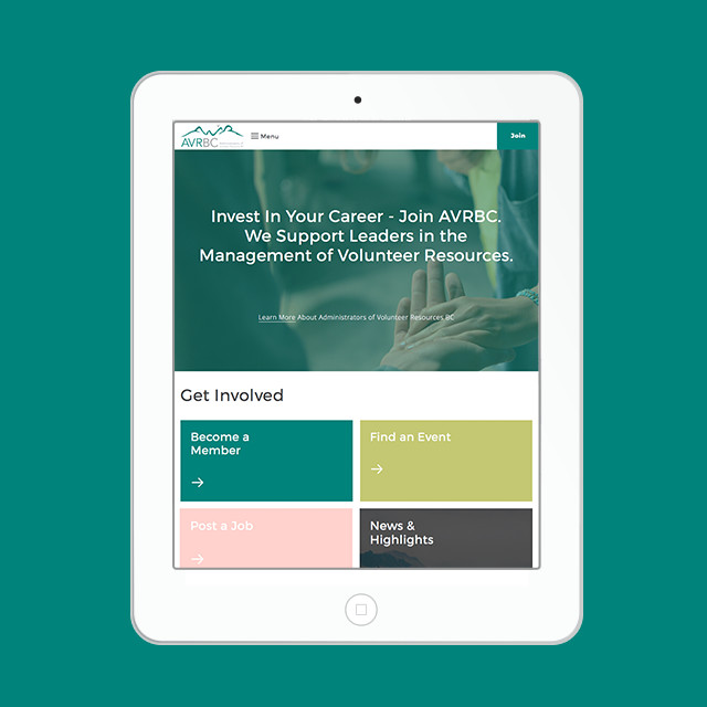
AVRBC promotes leadership in the ‘management of volunteer resources’. They provide a supportive network for their 150+ members, which themselves represent nearly 100 social-profit and governmental organizations throughout the province of British Columbia.

AVRBC was looking to move to the WordPress platform for it’s ease of use and to reduce the burden on their own volunteer board. In making the move they also wanted to improve membership sales and management, inspire members through design and build a responsive website.

The Solution

Using WordPress as a platform we were able to build a robust yet budget conscious website. It was our job to compile all AVRBC requests and goals and provide smart solutions using a mix of custom and trusted 3rd-party plugins. The end result was a happy client and custom WordPress theme that enabled:

  • Membership/conference purchase & automated registration
  • Engaging members only area (pages & resources only accessible to logged in members)
  • Member profile directory
  • Automated purchase & registration
  • Advanced forms for data collection
  • Custom public resources section (classified by custom icons)
  • Improved home page messaging to engage members and connect with prospects
  • Social media integration

Design / Development Features

Automated Membership Registration
When a customer purchases/renews a membership and completes their profile they are automatically upgraded in the backend to ‘Member’ status. This grants them access to member only pages & resources.
Member Directory
Each member has the option to create an online profile. They can edit their profile at anytime and view or connect with other members in the directory.
Member Restricted Content
AVRBC has the ability to restrict content based on user type. This is especially useful to share restricted information with members or conference attendees.
Easy Member Profile/ Data Exports
All member profiles are setup with a form submission. AVRBC can export all profiles or other advanced form data, in bulk, with 1 click and import the file into their other management tools.

Phase 1: Connecting the Dots - Not Inventing the Wheel

Our goal for this project was to use WordPress strategies, tools and trustworthy plugins that already exist, rather than quadrupling our clients budget to build from scratch. This involved a lot of upfront planning to map out the user flow and functionality. In the end we were able to provide a solid, budget friendly solution.

Geeky highlights include a WooCommerce purchase ID, connected to a custom checkout template that leads to a gravity form that connects with a gravity view and hooks-up with a groups user assignment. In english; user buys membership, fills out their profile and gains access to members only content and directory.

Phase 2: From logo to a brand

AVRBC came to use with a logo and 1 colour but not much else. This was exciting! We worked with them to create a brand colour palette and typographic system. We even designed a series of custom icons to better communicate their mission. These custom icons are also used in the resource section of the website to help classify blog posts.

Phase 3: Automation = Ease for Administration

The final product was a custom built WordPress theme with a design that connects and inspires the many members of AVRBC. One of the highlights for us, was the amount of AVRBC web team chores we eliminated. By building in automation of the members registration and directory we were able to reduce the workload on the volunteers, so they can focus on what matters most. Also the ability to export sections of member data with 1-click was a huge benefit for them to connect with other management platforms.

March 20, 2017Comments are off for this post.

NVCAC

Community Arts Centre Website | Responsive WordPress Design & Development

How do you build a stronger community through the arts and heritage? Founded in 1969, the North Vancouver Community Arts Council is a charitable community cultural organization whose mandate is to enable emerging and professional artists in all media and to bridge cultures and build strong communities through the arts and heritage.


The Brief

NVCAC is an organization that consists of a volunteer Board of Directors, an Executive Director and support staff, and over 100 dedicated volunteers. Their membership is over 500 strong and includes individuals, students, seniors, families, cultural groups and businesses.

Their website was outdated and their mobile users were dropping fast. They needed to better showcase the extensive depth of programming and resources offered - all on a mobile friendly platform.


The Solution

After series of prototypes (UX design) and complete interface design NVCAC made the leap to move from Drupal to WordPress. We were there to support them and implemented a strategic planning series to make the transition possible. We also wanted NVCAC to take advantage of the many tools/connections WordPress has to offer. The result was a custom built WordPress theme that includes e-commerce, art rental catalogue, membership area, and multiple custom post types to keep the backend organized.

The design is focused on bringing the NVCAC brand to life. We used the rich colours from their logo to classify different areas of the website. Every template design, focused on use of imagery from their database and this brought a new level of interaction and emotion to the online experience that was missing on the old website.

Design / Development Features

Memberships
The public can purchase NVCAC memberships online and gain access to member only pages (area), online profile submission and automated discounts.

E-Commerce
A full scale e-commerce solution that connects to their current POS. WooCommerce + Moneris  is used to sell event tickets, course registration, products, memberships, donations and more.

Digital Art Rental Catalogue
A custom template that showcases (without selling) individual art rental items. Users can also create their own wishlist and save it to their account for future reference.

Backend CMS Management
A series of custom fields were built in the backend to make publishing content easier on the NVCAC staff. This helps to keep their look consistent yet easy to manage.


Phase 1

From Drupal to WordPress - Strategy & Prototypes

This site was huge! And we were up for the challenge. Lots of planning was required to consider:

  • NVCAC user goals and our goals for them
  • The sitemap/ user navigation
  • Content flow
  • Migration of content
  • Development options and existing tools to reduce on budget

Before we get to the pretty stuff we always focus on wireframes or interactive prototypes. It’s important to set a good foundation to build on. We test with out clients and make sure all the bases are covered.


Phase 2

Designing for a Creative Community

Our goal was to help boost NVCAC brand awareness but also let the community culture and creative artwork shine! We choose collectively to pull colours from the NVCAC logo to help identify key areas of the website. We looked to Mondrian to find inspiration for using colour and grid system. It was also important to build a design system so that the large volume of pages on this site and external design materials could be kept uniform and void of clutter. This enabled the images of the community or artwork to pop!


Phase 3

Custom Post Types, E-Commerce, Catalogue & Memberships

This custom built WordPress theme has it all. Our favourite section is the art rental area. Since art is big and fragile NVCAC only wanted to showcase, and not sell art online. We took the benefits of using an e-commerce platform and build a custom template to showcase each item and the artists. It removes the ability to purchase but invites customers to contact NVCAC directly. The film & TV industry, corporations and homeowners can also save a collection online by creating a wishlist.


September 12, 2015Comments are off for this post.

ARC

Photography Blog Branding

Arc's mission is to educate & inspire creative’s to excel as artists & entrepreneurs. They believe in a new kind of learning environment that fosters creativity & social connections. They want to expose their readers to creative insight from photographers outside their own field. They believe learning from others will bring our community clarity, happiness and joy through creativity.

Arc contacted Paone Creative to develop a photography blog brand that connected with photographers & creatives alike. The brand needed to empower their inspiring, educational, interview style website. It was also important to pull inspiration from the geographical location of its inception - the west coast of Canada.

logo: Photography blog branding design for Arc. Design by Paone Creative, a Vancouver logo, branding and website designer.

Business cards: Photography blog branding design for Arc. Design by Paone Creative, a Vancouver logo, branding and website designer.

logo: Photography blog branding design for Arc. Design by Paone Creative, a Vancouver logo, branding and website designer.

copywriting: Photography blog branding design for Arc. Design by Paone Creative, a Vancouver logo, branding and website designer.

moodbord: Photography blog branding design for Arc. Design by Paone Creative, a Vancouver logo, branding and website designer.

colour palette: Photography blog branding design for Arc. Design by Paone Creative, a Vancouver logo, branding and website designer.

stationery: Photography blog branding design for Arc. Design by Paone Creative, a Vancouver logo, branding and website designer.

LAUNCH WEBSITE

September 5, 2015Comments are off for this post.

ManageWP Blog

Custom Blog UI Design

ManageWP is the world’s first and leading provider of WordPress management software. Their mission is to enhance your WordPress experience. ManageWP hosts a popular blog but the interface was lacking in spirit. Paone Creative worked in collaboration with Tom Ewer to design a custom UI for the ManageWP blog. The goal was to improve readability on all screen sizes with a clean and non-distracting interface. It was also important to highlight the individual authors that contribute to the blog. Paone Create also created a custom icon set to help define the blog categories.


ManageWP blog design Case  Study

ManageWP blog design Case  Study

ManageWP blog design Case  Study

ManageWP blog design Case  Study

ManageWP blog design Case  Study

"We hired Christina to design our new website and found a true professional in her field. Christina's approach was attentive, she would ask the right questions and make sure that every aspect of the project is taken care of."
-Vladimir Prelovac, Entrepreneur. Product strategist. CEO Devana Technologies.

LAUNCH WEBSITE

June 15, 2015Comments are off for this post.

Spectrum & Give Canada

Corporate Website Design & Development

Spectrum Marketing & Give Canada Fundraising both operate out of the same office, are managed by the same team and work to build lasting partnerships. However one is focused on corporate clients while the other is philanthropic focused. We built them a responsive WordPress website to showcase the strength of both businesses together. We also included a landing page template to highlight each business individually. To improve usability and recognition, Spectrum is showcased using the colour blue, Give Canada appears in red and combined they appear yellow.


Spectrum-portfolio-1000x500_04
Spectrum-portfolio-1000x500_01

Spectrum-portfolio-1000x500_02

Spectrum-portfolio-1000x500_03

Spectrum-portfolio-1000x500_05

"Spectrum Marketing and Give Canada Fundraising recently hired Paone Creative to redesign our website. Combining two unique companies into one was a challenge but Christina developed a workable, easy to navigate solution. With Christina's creativity our updated brand more fully engages our online audience. She was approachable, easy to work with and really took the time to understand our business and our needs."
-Pam Burns, Vice President at Spectrum Marketing / Give Canada Fundraising

LAUNCH WEBSITE

January 6, 2015Comments are off for this post.

604 Food Co

BC Food Manufacturer Branding & Packaging

Their mission is to enrich your kitchen with chef quality food products - inspired by the sea-to-sky lifestyle. 604 Food Co. is locally owned, locally produced and they do their best to source Canadian products. They live and eat in the sea-to-sky country and work hard to support local businesses. They produce chef quality products in sustainable packaging.

Paone Creative was tasked with creating a BC food manufacturer branding and packaging system that embodied this good-hearted product. The branding had to showcase the sea-to-sky, locally produced, spirit of the product. 604 Food Co is a startup business and we needed to make sure the packaging system was affordable yet looked professional as they expand.

BC Food Manufacturer Branding & Packaging design by Paone Creative, a Vancouver logo, branding and website design studio.

BC Food Manufacturer Branding & Packaging design by Paone Creative, a Vancouver logo, branding and website design studio.

BC Food Manufacturer Branding & Packaging design by Paone Creative, a Vancouver logo, branding and website design studio.

BC Food Manufacturer Branding & Packaging design by Paone Creative, a Vancouver logo, branding and website design studio.

BC Food Manufacturer Branding & Packaging design by Paone Creative, a Vancouver logo, branding and website design studio.

January 9, 2014Comments are off for this post.

Scandilicious

Vancouver Restaurant Branding & Packaging

It certainly is!™ This Vancouver restaurant branding is more than just a tasty logo. Scandilicious is a Scandinavian inspired bakery located on Commercial Drive. Their sweet and savoury waffles are best in Vancouver and the coffee is a must. The Scandilicious persona is fun, flirty and delicious - just like its’ wordmark. The logo suggests the wafting aromas, gooey batters and sweet sauces that are undeniably Scandilicious. Inspired by its’ heritage, the final letter 'S' stands tall to represent the prow of a Viking ship.


vancouver restaurant branding for Scandilicious. Paone Creative; a vancouver graphic designer offering logo, website and App UI design.

vancouver restaurant branding for Scandilicious. Paone Creative; a vancouver graphic designer offering logo, website and App UI design.

vancouver restaurant branding for Scandilicious. Paone Creative; a vancouver graphic designer offering logo, website and App UI design.

vancouver restaurant branding for Scandilicious. Paone Creative; a vancouver graphic designer offering logo, website and App UI design.

vancouver restaurant branding for Scandilicious.

vancouver restaurant branding for Scandilicious. Paone Creative; a vancouver graphic designer offering logo, website and App UI design.

Vancouver Restaurant Branding Solutions

Paone Creative worked closely with the owner of Scandilicious during the construction stages of their new business. Our goal was to create a bold new brand that could compete in the Vancouver restaurant branding and food marketplace.

Paone Creative worked closely with the restaurant owner to first develop a concrete brand persona and logo design strategy. Scandilicious came with a great name, it was our task to bring that brand persona and flirty name to life. The logo has a two part message, as you have read above. The brand was kept clean and traditional with a red, white and blue colour palette. The restaurant interiors & food truck match this Vancouver restaurant branding package. Anita, the founder, worked very hard to ensure her brand was ‘traditional Scandinavian’ rather than a stereotypical copycat. There is a lot of heart and tradition that goes into all the recipes served at Scandilicious.

Coffee Bag Design

No bakery experience is complete without wafting aromas of fresh brewed coffee. Paone Creative was happy to create a unique and versatile coffee bag. The bag had to amplify the visuals established for this Vancouver restaurant branding project. A ribbon pattern was made using the colours of the Norwegian flag. The ribbon wraps around the bag just like a parcel or a gift - it’s all wrapped up and ready for you to give. Scandilicious sells specialty blends of coffee in small batches. For economical purposes the bag was designed to be generic and a sticker is used to identify with the different bean types.

January 9, 2014Comments are off for this post.

Alfred Horie Construction

Vancouver Corporate Branding

Alfred Horie Construction offers buildings solutions in the province of British Columbia. The company has grown and evolved since opening it’s doors in Vancouver circa 1893. With their varied and expansive list of offerings the company needed to clarify their name, tagline and visual identity.

Solidifying an official name and tagline was no small achievement. The opinions regarding the company key offerings were varied, across a board of passionate individuals. Paone Creative worked with the group to discover a unified vision for the company. This is a great example of the Vancouver corporate branding services offered by Paone Creative.

vancouver corporate branding by Paone Creative .com - we offer boutique graphic design services for business in bc

vancouver corporate branding by Paone Creative .com - we offer boutique graphic design services for business in bc

vancouver corporate branding by Paone Creative .com - we offer boutique graphic design services for business in bc

vancouver corporate branding by Paone Creative .com - we offer boutique graphic design services for business in bc

vancouver corporate branding by Paone Creative .com - we offer boutique graphic design services for business in bc

vancouver corporate branding by Paone Creative .com - we offer boutique graphic design services for business in bc

Identity Solution

The new identity is a modern day approach to AHC’s past logo mark. It instils a sense of solid construction. An extensive stationery set was developed to unify their brand and extended to all company divisions. The business cards function as a mini portfolio for this Vancouver corporate branding project. Multiple cover images were chosen to showcase the different projects and services offered by AHC..

Website Solution

AHC had very little online presence. Their past website was built with poor technology and prohibited good SEO. We provided them with a branded WordPress website to boost their search engine rankings. The new company divisions of offerings had to be clearly accessible for this Vancouver corporate branding project. We also wanted to include a link to their historic past. A unique feature of the website is a live video stream from current job sites across Canada. This is a great way to engage your audience and also leaves you with a complete video of the process. Let’s talk about how Paone Creative can incorporate video content into your Vancouver corporate branding project.

Paone Creative worked to develop their YouTube page which was a strategic social media decision. No Vancouver corporate branding project is complete without great photography. Paone Creative was sent to various project sites to capture images after & during construction.

LAUNCH WEBSITE

January 8, 2014Comments are off for this post.

Patti Smyth

Holistic Nutritionist Brand & Stationery

Patti Smyth is a registered holistic nutritionist and passionate outdoor enthusiast. Her mantra is simple, ‘eat food - move your body’. Patti came to Paone Creative in need of a personal holistic nutritionist brand. Rather than building a brand around the stereotypical green and kraft textures Patti embraced the exploration process and we were able to discover a brand that will inspire.


holistic nutritionist branding by Paone Creative. We build brands that inspire; offering logo, website and App design in Gastown.

holistic nutritionist branding by Paone Creative. We build brands that inspire; offering logo, website and App design in Gastown.

holistic nutritionist branding by Paone Creative. We build brands that inspire; offering logo, website and App design in Gastown.

holistic nutritionist branding by Paone Creative. We build brands that inspire; offering logo, website and App design in Gastown.

holistic nutritionist branding by Paone Creative. We build brands that inspire; offering logo, website and App design in Gastown.

Our Solution For This Holistic Nutritionist Brand

Patti knew that just because she offered holistic lifestyle coaching didn’t mean she had to greenwash her brand. Since we were branding Patti as a person, we decided to embrace her favorite colour magenta. The watercolour texture provides a sense of wholesomeness and tactility to the brand. The logo works in contrast to this by offering a very clean solution. We also made sure to include her designation in her logo. Patti motivates other to live a clean and wholesome lifestyle and this holistic nutritionist brand represents just that.

To launch her new business we created an identity package for Patti: logo, stationery set and graphic standards. We also designed a promotional card that featured her most popular recipe. The goal of that card was to create something motivational and beautiful that clients are likely to keep in their kitchen. This identity package will set the tone as her holistic nutritionist brand grows.

November 18, 2013Comments are off for this post.

Rebecca Sehn

Childrens Book Themed Website

Rebecca Sehn is a talented children’s photographer based in Vancouver, BC. Rebecca had just made the transition to focus her business 100% on children’s photography and needed a website to evoke the whimsical personality of childhood. The focus was directed towards easy navigation and defining her key offerings. Custom illustration was used throughout the site and extended to all stationery items to set the tone for her Children’s book themed website and brand.

children's book themed website by www.PaoneCreative.com; a Vancouver design studio offering branding, website and App UI design

This video records the entire process of how the custom artwork was made for this children's book themed website. It’s an exclusive sneak peek into the attention and detail that we provide for every client.

children's book themed website by www.PaoneCreative.com; a Vancouver design studio offering branding, website and App UI design

Why WordPress?

The WordPress platform made it easy for Rebecca to manage & edit her website. She can simply log-in to her WordPress dashboard to edit text, images, layout and more. This custom children's book themed website was structured to work within the clients budget. However we always strive to allow for page variety. The primary goal was to set her apart from the competition by building a heavily branded visual experience – something more than a regular photographers portfolio.

How Was The Children’s Book Theme Brand Created?

Rebecca was a very adventurous client - which we love! Many photographer lean towards simplicity when it comes to their portfolio. Rebecca was the exact opposite - she wanted to create a fully branded environment. Our goal was to create a space that felt as if you were ‘alice’ and had just fallen into a, ink drawn, copy of your favourite childhood novel. All the artwork was hand-drawn by Paone Creative. We also create a custom alphabet and icons for this children's book themed website.

LAUNCH WEBSITE

Contact
[email protected]
Based in Vancouver, Canada

Contact Us
[email protected]
Based in Vancouver, Canada

Contact Us
[email protected]
Based in Vancouver, Canada

       
© 2017 Paone Creative | Privacy Policy

© 2017 Paone Creative | Privacy Policy

 © 2017 Paone Creative | Privacy Policy