January 9, 2014Comments are off for this post.

Alfred Horie Construction

Vancouver Corporate Branding

Alfred Horie Construction offers buildings solutions in the province of British Columbia. The company has grown and evolved since opening it’s doors in Vancouver circa 1893. With their varied and expansive list of offerings the company needed to clarify their name, tagline and visual identity.

Solidifying an official name and tagline was no small achievement. The opinions regarding the company key offerings were varied, across a board of passionate individuals. Paone Creative worked with the group to discover a unified vision for the company. This is a great example of the Vancouver corporate branding services offered by Paone Creative.

vancouver corporate branding by Paone Creative .com - we offer boutique graphic design services for business in bc

vancouver corporate branding by Paone Creative .com - we offer boutique graphic design services for business in bc

vancouver corporate branding by Paone Creative .com - we offer boutique graphic design services for business in bc

vancouver corporate branding by Paone Creative .com - we offer boutique graphic design services for business in bc

vancouver corporate branding by Paone Creative .com - we offer boutique graphic design services for business in bc

vancouver corporate branding by Paone Creative .com - we offer boutique graphic design services for business in bc

Identity Solution

The new identity is a modern day approach to AHC’s past logo mark. It instils a sense of solid construction. An extensive stationery set was developed to unify their brand and extended to all company divisions. The business cards function as a mini portfolio for this Vancouver corporate branding project. Multiple cover images were chosen to showcase the different projects and services offered by AHC..

Website Solution

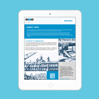
AHC had very little online presence. Their past website was built with poor technology and prohibited good SEO. We provided them with a branded WordPress website to boost their search engine rankings. The new company divisions of offerings had to be clearly accessible for this Vancouver corporate branding project. We also wanted to include a link to their historic past. A unique feature of the website is a live video stream from current job sites across Canada. This is a great way to engage your audience and also leaves you with a complete video of the process. Let’s talk about how Paone Creative can incorporate video content into your Vancouver corporate branding project.

Paone Creative worked to develop their YouTube page which was a strategic social media decision. No Vancouver corporate branding project is complete without great photography. Paone Creative was sent to various project sites to capture images after & during construction.

LAUNCH WEBSITE

November 18, 2013Comments are off for this post.

Rebecca Sehn

Childrens Book Themed Website

Rebecca Sehn is a talented children’s photographer based in Vancouver, BC. Rebecca had just made the transition to focus her business 100% on children’s photography and needed a website to evoke the whimsical personality of childhood. The focus was directed towards easy navigation and defining her key offerings. Custom illustration was used throughout the site and extended to all stationery items to set the tone for her Children’s book themed website and brand.

children's book themed website by www.PaoneCreative.com; a Vancouver design studio offering branding, website and App UI design

This video records the entire process of how the custom artwork was made for this children's book themed website. It’s an exclusive sneak peek into the attention and detail that we provide for every client.

children's book themed website by www.PaoneCreative.com; a Vancouver design studio offering branding, website and App UI design

Why WordPress?

The WordPress platform made it easy for Rebecca to manage & edit her website. She can simply log-in to her WordPress dashboard to edit text, images, layout and more. This custom children's book themed website was structured to work within the clients budget. However we always strive to allow for page variety. The primary goal was to set her apart from the competition by building a heavily branded visual experience – something more than a regular photographers portfolio.

How Was The Children’s Book Theme Brand Created?

Rebecca was a very adventurous client - which we love! Many photographer lean towards simplicity when it comes to their portfolio. Rebecca was the exact opposite - she wanted to create a fully branded environment. Our goal was to create a space that felt as if you were ‘alice’ and had just fallen into a, ink drawn, copy of your favourite childhood novel. All the artwork was hand-drawn by Paone Creative. We also create a custom alphabet and icons for this children's book themed website.

LAUNCH WEBSITE

November 17, 2013Comments are off for this post.

Riverwood Sales

Vancouver Restaurant Website Design & Illustration

Riverwood Sales is a leading Western Canadian Food Service Sales Agency. They came to Paone Creative in need of a new website. Their primary goal was to build a website that not only showcased their work, it also had to be easy to maintain and update. With this fun spirited group, Paone Creative was inspired to create a completely illustrated new brand.


vancouver restaurant website design by Paone Creative; a local studio offering logo, website and email marketing.

vancouver restaurant website design by Paone Creative; a local studio offering logo, website and email marketing.

vancouver restaurant website design by Paone Creative; a local studio offering logo, website and email marketing.

Why WordPress?

Our goal was to bring the spirited personality of the Riverwood staff to this online experience. We approached this project just as we would for a vancouver restaurant website design. We expanded on their existing colour pallet and incorporated custom illustration and typography to style this food services website. The staff connected so well with their brand re-fresh, that it was extended to all company communication tools.

WordPress was the perfect website platform because of its easy-to-use CMS (Content Management System). With WordPress tools, any staff member can make edits and additions to the website. This is a benefit to the company because it means reduced long-term expenses and allows for instant updates.

A custom interface was built to set Riverwood Sales apart from the competition and offer simplified navigation. Custom graphic illustration and google web fonts act as visual keys to showcase the personality of the company on this vancouver restaurant website design.

LAUNCH WEBSITE

November 16, 2013Comments are off for this post.

CAIN

The Canadian Association of International Nursing approached Paone Creative to aid in brand development for a their non-profit organization. We also designed and developed a website that allowed new and existing members pay their annual membership dues online. Paone Creative was happy to help establish this Vancouver non-profit brand.


Vancouver non-profit branding & website by Paone Creative .com; a Vancouver design studio offering branding, website and App UI design.

Vancouver non-profit branding & website by Paone Creative .com; a Vancouver design studio offering branding, website and App UI design.

Vancouver non-profit branding & website by Paone Creative .com; a Vancouver design studio offering branding, website and App UI design.

Vancouver non-profit branding & website by Paone Creative .com; a Vancouver design studio offering branding, website and App UI design.

Logo & Identity

The core message within the CAIN logo is depicted by two supportive hands, representing the flow of care passed from practitioner to patient. It is a story that resonates deeply with all nurses across all barriers: land, language, politics and beyond. These two hands are transformed to depict two speech bubbles emphasizing CAIN’s goal of enabling dialogue amongst Canadian nurses. The hands together form a globe wrapped by the symbol of a Canadian maple leaf. Our goal was to create a Vancouver non-profit brand that was bold yet meaningful.

Custom WordPress Website

CAIN connects nurses all across Canada and their website acts as the main interaction point. The website allowed us to bring this Vancouver non-profit brand to life, online. It positions CAIN as a forward thinking organization and works well to attract new members. WordPress was the preferred Content Management System for CAIN because of its easy-to-use editing tools. Since website management rolls will be transferred between members, the intuitive WordPress dashboard allows new managers to learn how to edit quickly.

Membership Registration & Payment

We built an e-commerce feature so that new and existing members could pay their annual membership dues through the website. They can pay with credit card via PayPal or by cheque. Members can also update their profile at anytime. All profiles and payments are recorded in the WordPress dashboard so CAIN can manage and export data easily. We made sure to extend the visuals created for this Vancouver non-profit brand to all aspects of the website.

LAUNCH WEBSITE

Contact
[email protected]
Based in Vancouver, Canada

Contact Us
[email protected]
Based in Vancouver, Canada

Contact Us
[email protected]
Based in Vancouver, Canada

       
© 2017 Paone Creative | Privacy Policy

© 2017 Paone Creative | Privacy Policy

 © 2017 Paone Creative | Privacy Policy