January 5, 2014Comments are off for this post.

Google+ UX Workshop

Learning to solve problems like the Google+ UX team

Last week I took a road-trip down to Portland, to enjoy some a amazing food and attend a Google+ UX workshop. The workshop was one of many events part of Design Week Portland (#DWPDX). If you are a designer or creative person of any type, add Design WeekPortland to your bucket list. It is a week long event series of open houses, workshops, lectures and a great opening night party.

Design at scale

Our first talk, was on the topic of design at Google+. The concept of 'design at scale', was introduced. At Google, they call it Moon Scale, meaning "it's 10x better not just 10% better - we have a healthy disregard for the impossible". This really established the theme for the day; we were going to problem solve on a moon scale.

A great example of this is Google maps. Think about how google maps has redefined the way we interact with geography. It didn't just make map reading easier and more accessible. Google maps introduced a completely new interaction on how we get from point A - B. Or think about how we can now visit a new city without leaving our home.


#dwpdx Photo by Gia Goodrich courtesy of Design Week Portland

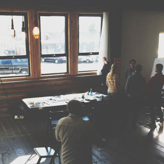
Christina at the workshop photo © Design Week Portland


Google+ UX Workshop: Our challenge for the day

On arrival we were greeted by the Google UX team and split into small groups of 5. Each group was given a Google+ mentor for the day to guide our process and push our ideas further. We were given the challenge of solving an issue, related to our growing urban populations. Could we identify a problem? Then create a solution and pitch it to a mock city of Portland/ Google business panel? All within a 5 hour span. This was definitely a day filled with moon scale thinking. Each team proposed some great solutions and products.

Throughout the day we were given 3 talks, here are some highlights...


Google+ UX Workshop: Photo by Gia Goodrich courtesy of Design Week Portland

Our first presentation of the day photo © Design Week Portland


Design Considerations

At Google, a designer has 3 primary considerations to be aware of...
- Human: who is going to use the product and how will it effect them.
- Engineering: "Design is the direction but engineering is the engine that gets us there".
- The Google brand: Does it look, feel and act like Google?


Google+ UX Workshop: Photo by Gia Goodrich courtesy of Design Week Portland

This is what most of the day looked like photo © Design Week Portland


Research Considerations

The talk started with the popular venn diagram that many creatives use to sell their clients on how design works - the 'good vs fast vs cheap' but you can only pick two. This also applies to project research. Here are some methods...

Fast & cheap user research: The Scrappy Method
Google things other people have found to be true. Creating lit reviews and competitor evaluations are a great place to start.

Cheap & Good: Ask Why?
Ask why you do what your doing. Don't force the question on your customers. Ladder your questions and work through solutions.

Fast & Good: The not so scrappy
Question your assumptions. Maybe this is a simple Q&A with your colleagues to confront assumptions. Or maybe you need to meet your user-base in their own environment to watch how they interact.


Google+ UX Workshop: Photo by Gia Goodrich courtesy of Design Week Portland

Our group brainstorming on sticky notes photo © Design Week Portland


Engineering Considerations

We also got a nice venn diagram during this talk. However the subject matter was very different. This diagram displayed the working relationship between the designer, engineer and Project Manager (the complete Google+ UX team). Each role has to work independently and also collaboratively.

Engineering considerations: Human & Brand, Privacy, Legal, Security, Technical.

Next we got on the topic of the North Star. At Google+ it is really important to have a high-level project goal, your North Star. This keeps your project on course; most likely changes to specific tasks will occur during a project but a North Star will keep you from straying too far off track. It is also great for communication between groups and gaining client/ executive buy-in.


Google+ UX Workshop: Photo by Gia Goodrich courtesy of Design Week Portland

Our group pitching the final idea photo © Design Week Portland


Event Hashtags

Check your network for Design Week Portland highlights & photos:
Google+ UX workshop: #gpluspdx
Design Week Portland: #dwpdx

Be sure to checkout more amazing photos of the event on flickr by Gia Goodrich.

November 17, 2013Comments are off for this post.

Fiitfu iphone App

iPhone App Design

Fiitfu was so happy with their branding and software UI design that they came back to Paone Creative to work on their new iphone app design. It was so exciting to see this Vancouver start-up grow and to help them develop a mobile specific platform for their clients. Fiitfu is a web based CRM program built specifically for network marketers. The software is built to help manage clients and products but more importantly aid in follow-up.

View the branding and software interface design work completed by Paone Creative here.

vancouver iphone app design for Fiitfu CRM. Design by Paone Creative, a Vancouver logo, website and app UI designer.

vancouver iphone app design for Fiitfu CRM. Design by Paone Creative, a Vancouver logo, website and app UI designer.

vancouver iphone app design for Fiitfu CRM. Design by Paone Creative, a Vancouver logo, website and app UI designer.

vancouver iphone app design for Fiitfu CRM. Design by Paone Creative, a Vancouver logo, website and app UI designer.

vancouver iphone app design for Fiitfu CRM. Design by Paone Creative, a Vancouver logo, website and app UI designer.

vancouver iphone app design for Fiitfu CRM. Design by Paone Creative, a Vancouver logo, website and app UI designer.

vancouver iphone app design for Fiitfu CRM. Design by Paone Creative, a Vancouver logo, website and app UI designer.

Why Build An iphone App?

Fiitfu is a web-based CRM service targeted at network marketers. Many of Fiitfu’s user base are individuals working from home or on the road. Many of them host meetings in coffee shops or out of the office. Fiitfu wanted to offer their clients a mobile solution to record meetings, look-up customer details and access their calendar. Fiitfu’s primary goal is to aid in follow up, so naturally this had to be at the center of the iphone app design.

Our goal was to offer an iphone app design that intuitive for working women aged 25-45. As with every app design, we wanted to ensure the client could use the app without a large learning curve. It was essential for the app to extend the function of the online software without confusing existing clients. This iphone app design also gave us an opportunity to improve the user interface of Fiitfu. We were able to move the brand forward while still keeping inline with the original brand message.

Our Solution

The Dashboard
Fiitfu as a company works very hard to motivate and inspire follow up with its users. We built the iphone app design around this company mission. The dashboard features a motivational quote, photo and goal. It also has a list of todays follow ups.

Navigation
We took advantage of the use of side panel navigation for this iphone app design. The left panel pulls out to reveal your main navigation area. We wanted to create easy action buttons for users-on-the-go. These key actions are: add a client , add a calendar item, record a meeting, and record a product given. Every action item guides users to ensure completion and improve success rates. The left panel slides out as an exclusive client list & client search area.

User Profiles
We wanted to have fun with the user profile design. We allow Fiitfu clients to add large volumes of client details. However the iphone app design allows for easy reading and divides the content into categories. Users can also upload a photo for every client.

vancouver iphone app design for Fiitfu CRM. Design by Paone Creative, a Vancouver logo, website and app UI designer.

September 18, 2013Comments are off for this post.

Fiitfu CRM Solutions

Fiitfu CRM Solutions is a start-up company that came to Paone Creative looking for a CRM branding and product design package. Fiitfu is a web based CRM program built specifically for network marketers. The software is built to help manage clients and products but more importantly aid in follow-up.

CRM User Interface design by Paone Creative

Branding elements & logo sketch | CRM branding by Paone Creative .com; a Vancouver design studio offering branding, website and App UI design.

CRM User Interface | CRM branding by Paone Creative .com; a Vancouver design studio offering branding, website and App UI design.

website design | CRM branding by Paone Creative .com; a Vancouver design studio offering branding, website and App UI design.

Identity & Logo Design

Paone Creative provided Fiitfu with a complete CRM branding package. We developed the logo, stationery and brand aesthetics. The name Fiitfu was conceived as an acronym ‘Fortune Is In The Follow-up” but it has now evolved to represent much more. A wordmark was chosen to build name recognition online. Custom lettering was drawn to resonate with an energetic and motivated individual. The top of the letter ‘F’ was shaped into an arrow to represent the motion of ‘Follow-up’. A secondary element was created for the CRM branding to incorporate colour and energy. The spiral like shapes are inspired by a slinky toy, notorious for its continuous crawling forward motion.

Software UI Design

After establishing the new brand Paone Creative began work on the software user interface design. Our goal was to inject the lively & forward thinking personality of the CRM branding into the user interface design. We did this through the use of colour and engaging design elements.

Email Newsletter Marketing

Paone Creative designed, developed and managed a series of email newsletter campaigns for Fittfu. The email newsletter template was designed with flexibility to fit various content volumes. Each newsletter is built in HTML code to ensure direct inbox delivery and allows subscribers to open emails on their iPhone. The template was custom designed to incorporate the colourful Fiitfu CRM branding and strategically placed buttons to increase ‘click’ rates.

First we developed a strategy to help Fiitfu build their online community. The strategy focused on monthly email newsletters that would highlight blog posts and content from the main sales website. Paone Creative managed the design and delivery of every issue with a successful open rate.

LAUNCH WEBSITE

Contact
[email protected]
Based in Vancouver, Canada

Contact Us
[email protected]
Based in Vancouver, Canada

Contact Us
[email protected]
Based in Vancouver, Canada

       
© 2017 Paone Creative | Privacy Policy

© 2017 Paone Creative | Privacy Policy

 © 2017 Paone Creative | Privacy Policy