September 12, 2015Comments are off for this post.

ARC

Photography Blog Branding

Arc's mission is to educate & inspire creative’s to excel as artists & entrepreneurs. They believe in a new kind of learning environment that fosters creativity & social connections. They want to expose their readers to creative insight from photographers outside their own field. They believe learning from others will bring our community clarity, happiness and joy through creativity.

Arc contacted Paone Creative to develop a photography blog brand that connected with photographers & creatives alike. The brand needed to empower their inspiring, educational, interview style website. It was also important to pull inspiration from the geographical location of its inception - the west coast of Canada.

logo: Photography blog branding design for Arc. Design by Paone Creative, a Vancouver logo, branding and website designer.

Business cards: Photography blog branding design for Arc. Design by Paone Creative, a Vancouver logo, branding and website designer.

logo: Photography blog branding design for Arc. Design by Paone Creative, a Vancouver logo, branding and website designer.

copywriting: Photography blog branding design for Arc. Design by Paone Creative, a Vancouver logo, branding and website designer.

moodbord: Photography blog branding design for Arc. Design by Paone Creative, a Vancouver logo, branding and website designer.

colour palette: Photography blog branding design for Arc. Design by Paone Creative, a Vancouver logo, branding and website designer.

stationery: Photography blog branding design for Arc. Design by Paone Creative, a Vancouver logo, branding and website designer.

LAUNCH WEBSITE

January 6, 2015Comments are off for this post.

604 Food Co

BC Food Manufacturer Branding & Packaging

Their mission is to enrich your kitchen with chef quality food products - inspired by the sea-to-sky lifestyle. 604 Food Co. is locally owned, locally produced and they do their best to source Canadian products. They live and eat in the sea-to-sky country and work hard to support local businesses. They produce chef quality products in sustainable packaging.

Paone Creative was tasked with creating a BC food manufacturer branding and packaging system that embodied this good-hearted product. The branding had to showcase the sea-to-sky, locally produced, spirit of the product. 604 Food Co is a startup business and we needed to make sure the packaging system was affordable yet looked professional as they expand.

BC Food Manufacturer Branding & Packaging design by Paone Creative, a Vancouver logo, branding and website design studio.

BC Food Manufacturer Branding & Packaging design by Paone Creative, a Vancouver logo, branding and website design studio.

BC Food Manufacturer Branding & Packaging design by Paone Creative, a Vancouver logo, branding and website design studio.

BC Food Manufacturer Branding & Packaging design by Paone Creative, a Vancouver logo, branding and website design studio.

BC Food Manufacturer Branding & Packaging design by Paone Creative, a Vancouver logo, branding and website design studio.

January 9, 2014Comments are off for this post.

Scandilicious

Vancouver Restaurant Branding & Packaging

It certainly is!™ This Vancouver restaurant branding is more than just a tasty logo. Scandilicious is a Scandinavian inspired bakery located on Commercial Drive. Their sweet and savoury waffles are best in Vancouver and the coffee is a must. The Scandilicious persona is fun, flirty and delicious - just like its’ wordmark. The logo suggests the wafting aromas, gooey batters and sweet sauces that are undeniably Scandilicious. Inspired by its’ heritage, the final letter 'S' stands tall to represent the prow of a Viking ship.


vancouver restaurant branding for Scandilicious. Paone Creative; a vancouver graphic designer offering logo, website and App UI design.

vancouver restaurant branding for Scandilicious. Paone Creative; a vancouver graphic designer offering logo, website and App UI design.

vancouver restaurant branding for Scandilicious. Paone Creative; a vancouver graphic designer offering logo, website and App UI design.

vancouver restaurant branding for Scandilicious. Paone Creative; a vancouver graphic designer offering logo, website and App UI design.

vancouver restaurant branding for Scandilicious.

vancouver restaurant branding for Scandilicious. Paone Creative; a vancouver graphic designer offering logo, website and App UI design.

Vancouver Restaurant Branding Solutions

Paone Creative worked closely with the owner of Scandilicious during the construction stages of their new business. Our goal was to create a bold new brand that could compete in the Vancouver restaurant branding and food marketplace.

Paone Creative worked closely with the restaurant owner to first develop a concrete brand persona and logo design strategy. Scandilicious came with a great name, it was our task to bring that brand persona and flirty name to life. The logo has a two part message, as you have read above. The brand was kept clean and traditional with a red, white and blue colour palette. The restaurant interiors & food truck match this Vancouver restaurant branding package. Anita, the founder, worked very hard to ensure her brand was ‘traditional Scandinavian’ rather than a stereotypical copycat. There is a lot of heart and tradition that goes into all the recipes served at Scandilicious.

Coffee Bag Design

No bakery experience is complete without wafting aromas of fresh brewed coffee. Paone Creative was happy to create a unique and versatile coffee bag. The bag had to amplify the visuals established for this Vancouver restaurant branding project. A ribbon pattern was made using the colours of the Norwegian flag. The ribbon wraps around the bag just like a parcel or a gift - it’s all wrapped up and ready for you to give. Scandilicious sells specialty blends of coffee in small batches. For economical purposes the bag was designed to be generic and a sticker is used to identify with the different bean types.

January 9, 2014Comments are off for this post.

Alfred Horie Construction

Vancouver Corporate Branding

Alfred Horie Construction offers buildings solutions in the province of British Columbia. The company has grown and evolved since opening it’s doors in Vancouver circa 1893. With their varied and expansive list of offerings the company needed to clarify their name, tagline and visual identity.

Solidifying an official name and tagline was no small achievement. The opinions regarding the company key offerings were varied, across a board of passionate individuals. Paone Creative worked with the group to discover a unified vision for the company. This is a great example of the Vancouver corporate branding services offered by Paone Creative.

vancouver corporate branding by Paone Creative .com - we offer boutique graphic design services for business in bc

vancouver corporate branding by Paone Creative .com - we offer boutique graphic design services for business in bc

vancouver corporate branding by Paone Creative .com - we offer boutique graphic design services for business in bc

vancouver corporate branding by Paone Creative .com - we offer boutique graphic design services for business in bc

vancouver corporate branding by Paone Creative .com - we offer boutique graphic design services for business in bc

vancouver corporate branding by Paone Creative .com - we offer boutique graphic design services for business in bc

Identity Solution

The new identity is a modern day approach to AHC’s past logo mark. It instils a sense of solid construction. An extensive stationery set was developed to unify their brand and extended to all company divisions. The business cards function as a mini portfolio for this Vancouver corporate branding project. Multiple cover images were chosen to showcase the different projects and services offered by AHC..

Website Solution

AHC had very little online presence. Their past website was built with poor technology and prohibited good SEO. We provided them with a branded WordPress website to boost their search engine rankings. The new company divisions of offerings had to be clearly accessible for this Vancouver corporate branding project. We also wanted to include a link to their historic past. A unique feature of the website is a live video stream from current job sites across Canada. This is a great way to engage your audience and also leaves you with a complete video of the process. Let’s talk about how Paone Creative can incorporate video content into your Vancouver corporate branding project.

Paone Creative worked to develop their YouTube page which was a strategic social media decision. No Vancouver corporate branding project is complete without great photography. Paone Creative was sent to various project sites to capture images after & during construction.

LAUNCH WEBSITE

January 8, 2014Comments are off for this post.

Patti Smyth

Holistic Nutritionist Brand & Stationery

Patti Smyth is a registered holistic nutritionist and passionate outdoor enthusiast. Her mantra is simple, ‘eat food - move your body’. Patti came to Paone Creative in need of a personal holistic nutritionist brand. Rather than building a brand around the stereotypical green and kraft textures Patti embraced the exploration process and we were able to discover a brand that will inspire.


holistic nutritionist branding by Paone Creative. We build brands that inspire; offering logo, website and App design in Gastown.

holistic nutritionist branding by Paone Creative. We build brands that inspire; offering logo, website and App design in Gastown.

holistic nutritionist branding by Paone Creative. We build brands that inspire; offering logo, website and App design in Gastown.

holistic nutritionist branding by Paone Creative. We build brands that inspire; offering logo, website and App design in Gastown.

holistic nutritionist branding by Paone Creative. We build brands that inspire; offering logo, website and App design in Gastown.

Our Solution For This Holistic Nutritionist Brand

Patti knew that just because she offered holistic lifestyle coaching didn’t mean she had to greenwash her brand. Since we were branding Patti as a person, we decided to embrace her favorite colour magenta. The watercolour texture provides a sense of wholesomeness and tactility to the brand. The logo works in contrast to this by offering a very clean solution. We also made sure to include her designation in her logo. Patti motivates other to live a clean and wholesome lifestyle and this holistic nutritionist brand represents just that.

To launch her new business we created an identity package for Patti: logo, stationery set and graphic standards. We also designed a promotional card that featured her most popular recipe. The goal of that card was to create something motivational and beautiful that clients are likely to keep in their kitchen. This identity package will set the tone as her holistic nutritionist brand grows.

September 18, 2013Comments are off for this post.

ON TRAC

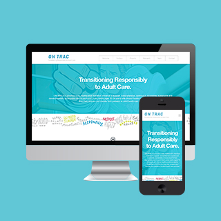
ON TRAC is a healthcare initiative at BC Children’s Hospital. The program goal is to build awareness and develop tools to help youth Transition Responsibly To Adult Care. The initiative was in need of a visual identity to unite a wide variety of program aspects. This Vancouver healthcare branding project also directs ownership and recognition to ON TRAC.

Vancouver healthcare branding and website design services from Paone Creative. We build brands that inspire!

Vancouver healthcare branding and website design services from Paone Creative. We build brands that inspire!

Vancouver healthcare branding and website design services from Paone Creative. We build brands that inspire!

Vancouver healthcare branding and website design services from Paone Creative. We build brands that inspire!

Vancouver healthcare branding and website design services from Paone Creative. We build brands that inspire!

Vancouver healthcare branding and website design services from Paone Creative. We build brands that inspire!

Logo Design & Identity Package

The logo was designed to represent two coexistent stories. A story of prescribed health and a story of its motivating network. A wordmark was chosen to build name recognition for this Vancouver healthcare branding project. Team sports inspired the logo’s typeface to connect with the primary youth audience.

The letter ‘R’ became a focal point within the wordmark. It symbolizes the abbreviation (Rx) for Prescription: a program for health-care. It also represents the interchangeable key ‘R’ words that define the characteristics & goals of the program.

Included in this Vancouver healthcare branding package:
Logo & Icons
Stationery Set: Business Card, Letterhead, Power Point Template
Rack Card Brochures & Trade Show Banners
E-mail Newsletter Marketing

Email Newsletter Template & Delivery Management

ON TRAC also asked us to help with their bi-annual email newsletter. Paone Creative built a custom template to fit large volumes of content. The design also incorporated strategically placed buttons to increase ‘click’ rates. Each newsletter is built in HTML to ensure direct inbox delivery and also allows subscribers to open emails on their iPhone.

Paone Creative manages the design and delivery of every issue for this Vancouver healthcare branding project. We collect the content from the ON TRAC team, design, program and manage delivery through MailChimp.

*Disclaimer: This logo design is not currently in use by the ON TRAC division as projects at BC Children's Hospital do not use a unique logo for communication.

LAUNCH WEBSITE

Contact
[email protected]
Based in Vancouver, Canada

Contact Us
[email protected]
Based in Vancouver, Canada

Contact Us
[email protected]
Based in Vancouver, Canada

       
© 2017 Paone Creative | Privacy Policy

© 2017 Paone Creative | Privacy Policy

 © 2017 Paone Creative | Privacy Policy