November 2, 2019Comments are off for this post.

SEO For Image Heavy Websites

Our Top 10 Tips to Improve SEO for Image Heavy Websites

We all know text based content is essential for good SEO (Search Engine Optimization). We also know that heavy text based content is not always the most visually appealing or engaging.

40% of people will respond better to visual information than plain text.

Or maybe you just want a minimal website to focus on product photography. If you own an image heavy e-commerce or portfolio based website there are still many options to improve your SEO. First step is to make sure your website is built with WordPress - we can help you with this one.

Smart Design Choices

1. Create An Illusion

If you are going for a minimalist design approach, hidden text content is a great solution. You can also design text areas below the fold, so that viewers focus on your key image first, text second.

Try the 'Click to expand' technique. Take an icon or short text excerpt, that when clicked, expands to reveal more keyword heavy content. Your site will appear minimalist to viewers but still enables the Google bots to read your hidden text.

2. Create a Text Heavy Footer

Many people skip over your footer so it's a great place to pack in those core keywords. If you can handle it, aim for 300 characters and a few cross links to key areas of your website. A great designer can make this an engaging area and avoid it appearing spammy.

3. Cornerstone Content

These are also known as landing pages. Take some time to write 1-3 regular text length pages, that highlight your key services. Aim for 300 characters and employ good SEO writing techniques. If your website is image based most likely these will be your top ranking search engine pages, so make sure they shine.

4. Write an Image Sitemap

Just like a regular page sitemap you can write an image sitemap. This will ensure that search engines index your images. Check that all important images are included in the sitemap. You can see what Google has to say here.

The Page Setup

5. Choose a Focus Keyword

This is a really important point. You still need to choose a unique keyword for every page. This keyword will be added to each image file name, alt tag and page description. If your keyword is used consistently throughout the page, search engines will have a clear understanding of your content. They will use this keyword to categorize your page.

6. Page Title

If your page is image heavy, giving it a unique & descriptive page title will be a great improvement. Think of news headlines; it should include your keyword while remaining engaging. If you don't want your page title to appear spammy on the actual page then use a WordPress plugin call SEO by Yoast.

Structure: Keyword Phrase - Clickable Title - Your Name & Location
Sample: SEO For Image Heavy Websites | Our Top 10 List | Paone Creative Vancouver

7. Meta Description

Even if you don't have text content on your page you should still give it a meta description. Be sure to include your keyword again and describe who you are. The most important part is to describe something unique about the page.

Optimize Each Image

8. Image File Name

Include your keyword (the one chosen for the page your image will appear on) in the image file name. Try to avoid adding your own classification system to the file name. Instead add a single descriptive word and your business name.

Structure: Keyword Phrase - Description - Your Name
Sample:seo-for-image-heavy-websites-screenshot-paone-creative.jpg

9. Image Size

Speed is a major usability factor for search engines and also your users. No one likes a slow website. Make sure to keep your image file size low without loosing too much quality.

If you use Photoshop the best method is to ‘save image for web’. Aim to keep you file size under 100 kb (for large images) & under 50 kb for smaller ones.

10. Alt Tags

This is also known as alternate text. It was originally developed to aid the visually impaired and describe what appears on the screen. This is also read by search engines as regular HTML (text based content). To keep life simple, use a similar system as the image file name. You can also add in more descriptive words if necessary. EX: alt="SEO for image heavy websites screenshot from Paone Creative".

Need help with SEO? We work hard for entrepreneurs - Contact Paone Creative Today.
January 5, 2014Comments are off for this post.

Google+ UX Workshop

Learning to solve problems like the Google+ UX team

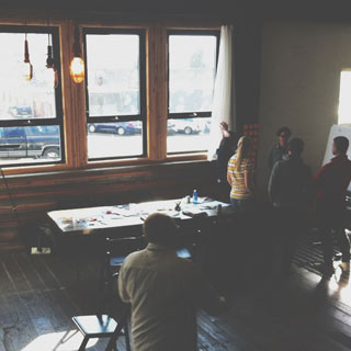
Last week I took a road-trip down to Portland, to enjoy some a amazing food and attend a Google+ UX workshop. The workshop was one of many events part of Design Week Portland (#DWPDX). If you are a designer or creative person of any type, add Design WeekPortland to your bucket list. It is a week long event series of open houses, workshops, lectures and a great opening night party.

Design at scale

Our first talk, was on the topic of design at Google+. The concept of 'design at scale', was introduced. At Google, they call it Moon Scale, meaning "it's 10x better not just 10% better - we have a healthy disregard for the impossible". This really established the theme for the day; we were going to problem solve on a moon scale.

A great example of this is Google maps. Think about how google maps has redefined the way we interact with geography. It didn't just make map reading easier and more accessible. Google maps introduced a completely new interaction on how we get from point A - B. Or think about how we can now visit a new city without leaving our home.


#dwpdx Photo by Gia Goodrich courtesy of Design Week Portland

Christina at the workshop photo © Design Week Portland


Google+ UX Workshop: Our challenge for the day

On arrival we were greeted by the Google UX team and split into small groups of 5. Each group was given a Google+ mentor for the day to guide our process and push our ideas further. We were given the challenge of solving an issue, related to our growing urban populations. Could we identify a problem? Then create a solution and pitch it to a mock city of Portland/ Google business panel? All within a 5 hour span. This was definitely a day filled with moon scale thinking. Each team proposed some great solutions and products.

Throughout the day we were given 3 talks, here are some highlights...


Google+ UX Workshop: Photo by Gia Goodrich courtesy of Design Week Portland

Our first presentation of the day photo © Design Week Portland


Design Considerations

At Google, a designer has 3 primary considerations to be aware of...
- Human: who is going to use the product and how will it effect them.
- Engineering: "Design is the direction but engineering is the engine that gets us there".
- The Google brand: Does it look, feel and act like Google?


Google+ UX Workshop: Photo by Gia Goodrich courtesy of Design Week Portland

This is what most of the day looked like photo © Design Week Portland


Research Considerations

The talk started with the popular venn diagram that many creatives use to sell their clients on how design works - the 'good vs fast vs cheap' but you can only pick two. This also applies to project research. Here are some methods...

Fast & cheap user research: The Scrappy Method
Google things other people have found to be true. Creating lit reviews and competitor evaluations are a great place to start.

Cheap & Good: Ask Why?
Ask why you do what your doing. Don't force the question on your customers. Ladder your questions and work through solutions.

Fast & Good: The not so scrappy
Question your assumptions. Maybe this is a simple Q&A with your colleagues to confront assumptions. Or maybe you need to meet your user-base in their own environment to watch how they interact.


Google+ UX Workshop: Photo by Gia Goodrich courtesy of Design Week Portland

Our group brainstorming on sticky notes photo © Design Week Portland


Engineering Considerations

We also got a nice venn diagram during this talk. However the subject matter was very different. This diagram displayed the working relationship between the designer, engineer and Project Manager (the complete Google+ UX team). Each role has to work independently and also collaboratively.

Engineering considerations: Human & Brand, Privacy, Legal, Security, Technical.

Next we got on the topic of the North Star. At Google+ it is really important to have a high-level project goal, your North Star. This keeps your project on course; most likely changes to specific tasks will occur during a project but a North Star will keep you from straying too far off track. It is also great for communication between groups and gaining client/ executive buy-in.


Google+ UX Workshop: Photo by Gia Goodrich courtesy of Design Week Portland

Our group pitching the final idea photo © Design Week Portland


Event Hashtags

Check your network for Design Week Portland highlights & photos:
Google+ UX workshop: #gpluspdx
Design Week Portland: #dwpdx

Be sure to checkout more amazing photos of the event on flickr by Gia Goodrich.

September 15, 2013Comments are off for this post.

The Sketchbook Project

The Sketchbook Project is a “constantly evolving library of artists’ sketchbooks from across the globe”, organized by the Art House Co-op. Each year thousands of sketchbooks are collected and exhibited on a world wide tour before they join the Brooklyn Art Library. This is a submission for the 2012 tour. Participants at the show are encouraged to ‘bring the story to life’ by scanning the QR code found within the book. They can then watch as the process unfolds in this video as they flip through the tactile pages of the sketchbook.

Contact
[email protected]
Based in Vancouver, Canada

Contact Us
[email protected]
Based in Vancouver, Canada

Contact Us
[email protected]
Based in Vancouver, Canada

       
© 2017 Paone Creative | Privacy Policy

© 2017 Paone Creative | Privacy Policy

 © 2017 Paone Creative | Privacy Policy